


BACKGROUND
The theme of this task is an online supermarket, so I made research on several big grocery shop stores overseas, in Europe, and in the USA. Except for the convenience of buying food and beverage on the net, I felt not all the famous stores necessarily brought the expected digital shopping experience.
BRIEF:
UI/UX DESIGN SCREEN CONCEPT FOR ONLINE ‘SUPER DELI’ GROCERY CHAIN STORES
UI/UX DESIGN SCREEN CONCEPT FOR ONLINE ‘SUPER DELI’ GROCERY CHAIN STORES
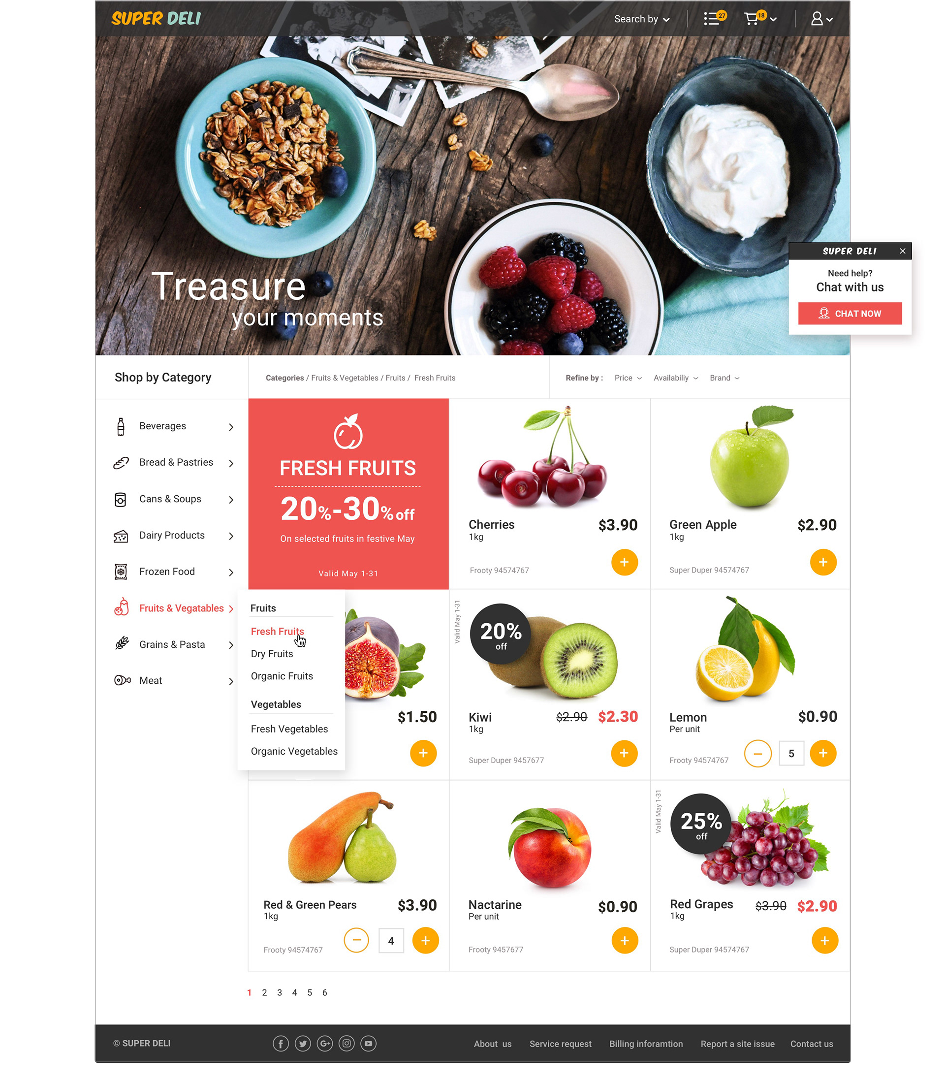
1. The products are divided into categories. Each category is divided into sub-categories or another level of division.
2. Some products may be on sale and also offer valid.
3. There are equivalent products and there are products that are sold separately.
4. Each product contains an image | price | size | brand | price per weight | catalog no.
5. Each wanted product is added to the shopping basket, and able to get updated or removed
6. List of actions: | search by product name/brand | chat with customer service | purchase | save a list to the customer
WIREFRAME
Although the assignment contained a complex capabilities system, I tried to create it as much simple and friendly for the customer.
Here is the wireframe I created.
Here is the wireframe I created.
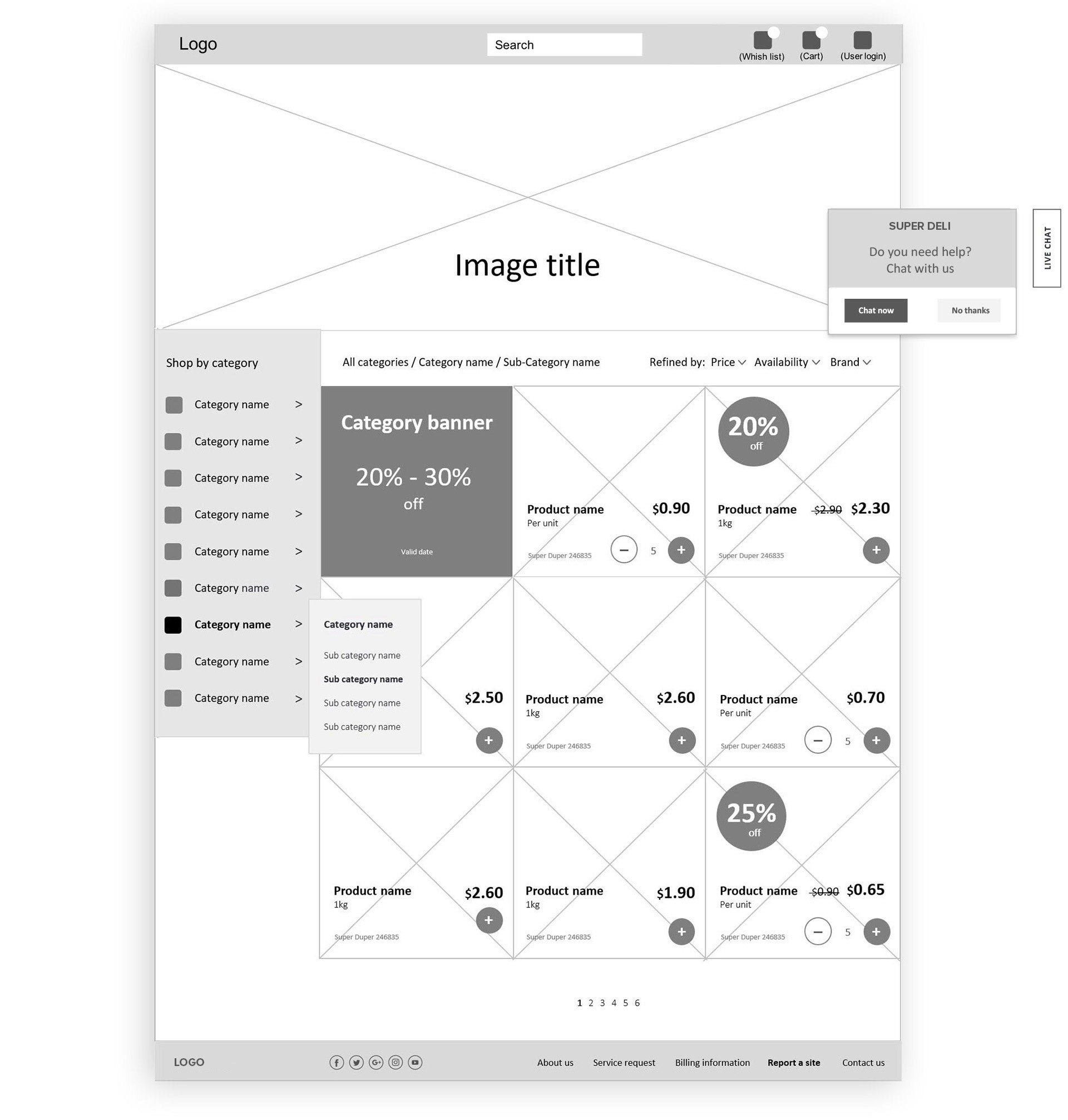
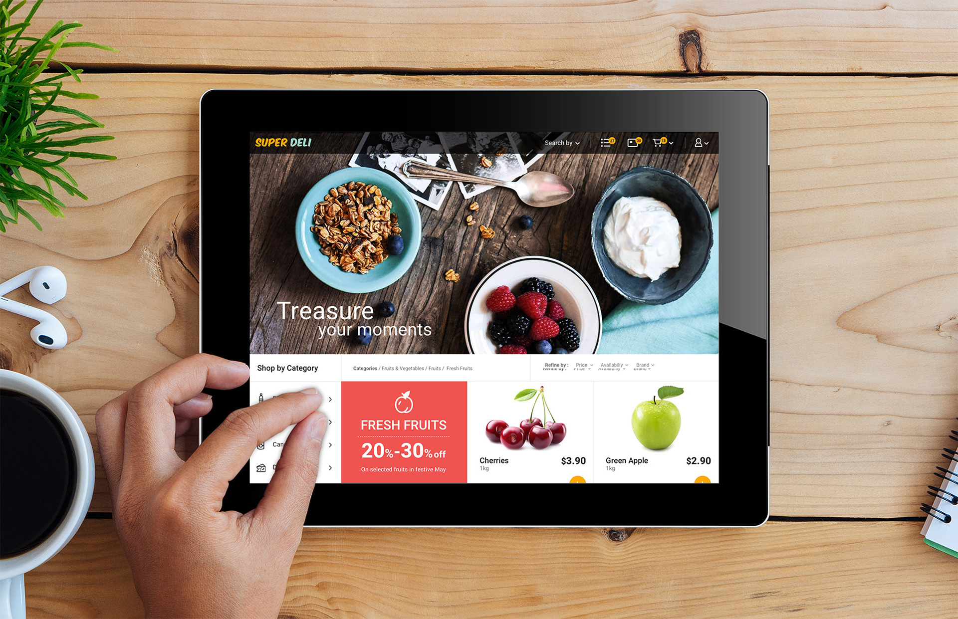
1. Navigation bar: I placed the login user, and 3 conventional options: user, shopping cart, and shopping wish list.
The payment active will take place after clicking on the cart icon, and the user gets a window with a list of all the products he has marked and then moves forward to buying
The payment active will take place after clicking on the cart icon, and the user gets a window with a list of all the products he has marked and then moves forward to buying
2. The main image: I thought of a special nostalgic image with the right title, that will appeal to the customer's feelings.
This image and the slogan I thought of: 'Treasure your moments' could be associated with our favorite grocery store.
This image and the slogan I thought of: 'Treasure your moments' could be associated with our favorite grocery store.
3. Side menu + Products screen: “Shop by categories”. I designed here an icons language. After selecting his preferred category, the user gets the relevant screen, and with refining options
4. Product cards: I created a clean, simple look for the product cards, with clear and attractive images of the products. The cards contained all the components from the brief.
Several products are discounted.
5. Banner of seasonal discounts for products, placed first, before the product cards.
6. Footer: contains links for social networks, and also other issues of customer service
7. Popups: a live chat popup option
Several products are discounted.
5. Banner of seasonal discounts for products, placed first, before the product cards.
6. Footer: contains links for social networks, and also other issues of customer service
7. Popups: a live chat popup option
DESIGN
All my design decisions: including selecting images, layout, colors, typography, and icon design, were made from scratch, referring to the assignment brief, and based on the wireframe I created.
All my design decisions: including selecting images, layout, colors, typography, and icon design, were made from scratch, referring to the assignment brief, and based on the wireframe I created.
COLORS. ICONS. TYPOGRAPHY.
