


CREATING A design language for complex system screens
An ongoing complex system project of analytical solutions for sales and marketing teams, in the
Pharma industries. I was asked to create from scratch, a design language for the first dashboard screen
In order to segment sales performance data for a particular region/country, we first select
the Slicers button on the side menu. After a short filtering process, we will get this Performance screen
where we can view the data obtained, by choosing a tab where the no. of weeks is relevant to us.
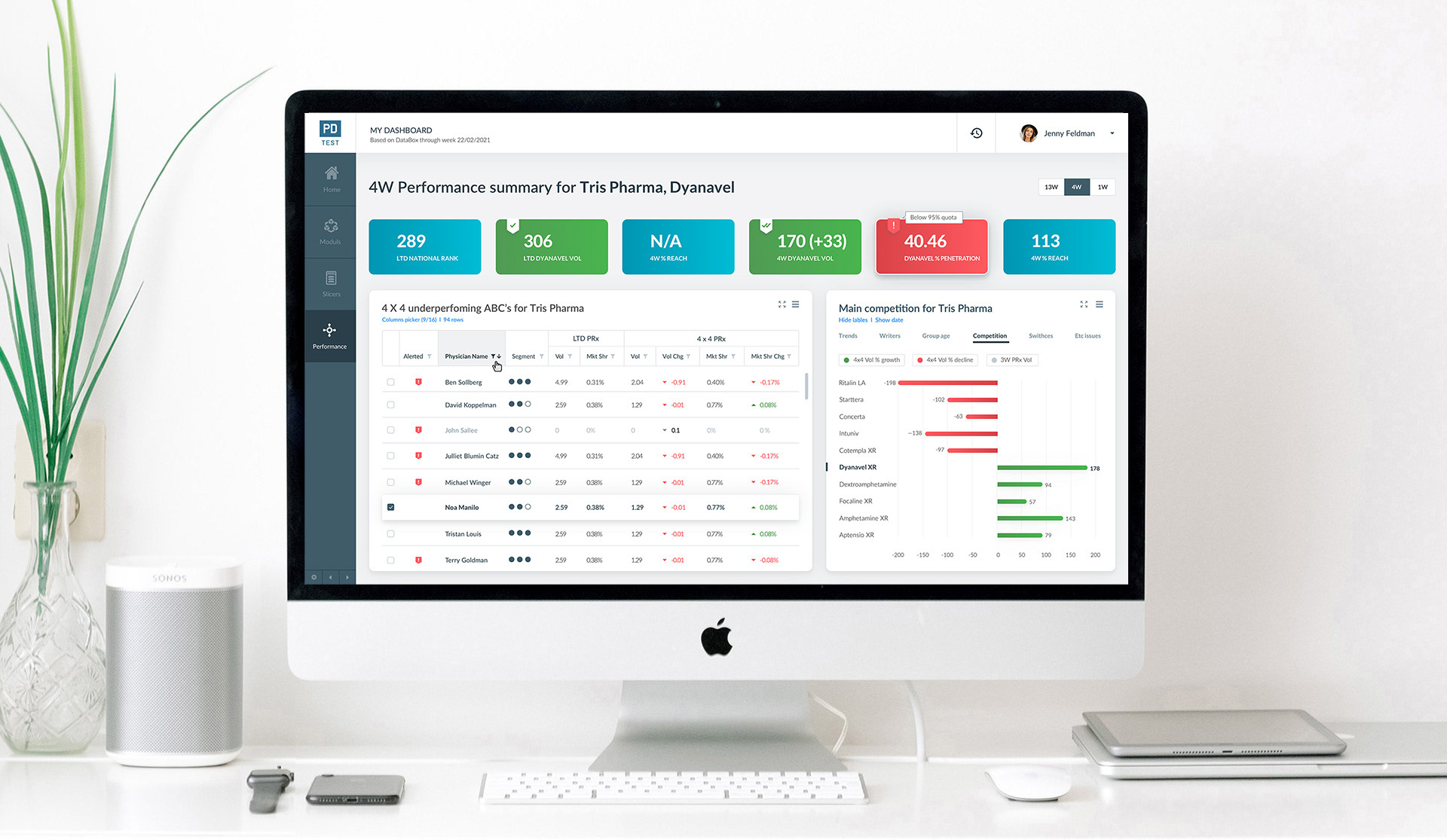
design PROCESS FOR DASHBOARD
Top Data Widget:
I decided to design the 6 data "bricks" widgets for complex metrics by the color key scheme for the scale of statuses: negative + neutral + positive + excellent.
On mouse over the matching tag icons, we will get the value borders of each status.
Table:
The table's data gives a detailed glimpse of the sales of each team agitator through many filters.
In addition, the physician gets a dynamic rating of 1, 2, or 3 dots segmentation according to his actual
sales results.
Graph:
Under the "Competition" category you will get a graph that compares the sales results of our product
with other competing products, depending on their location in the positive to negative data specification
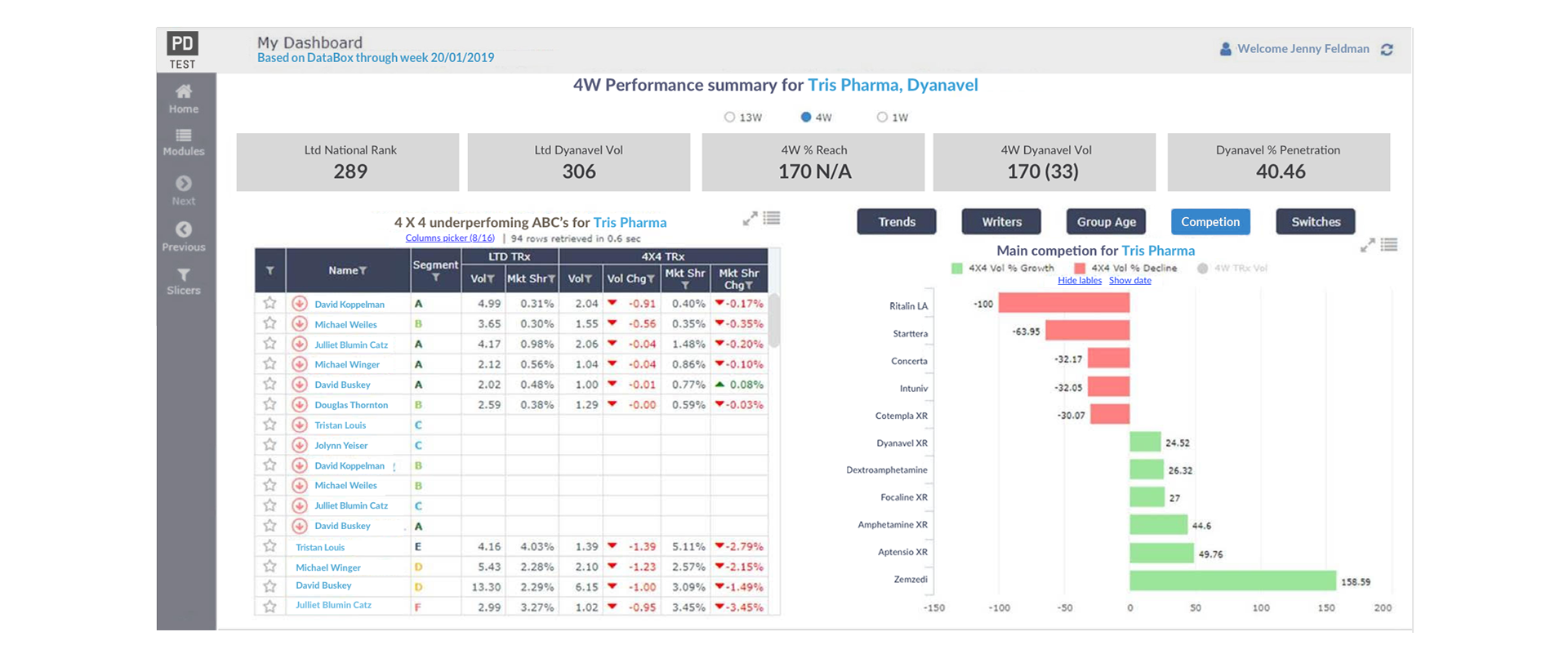
PREVIOUS mockup screen, from the Client:
MAIN SCREEN DESIGN:
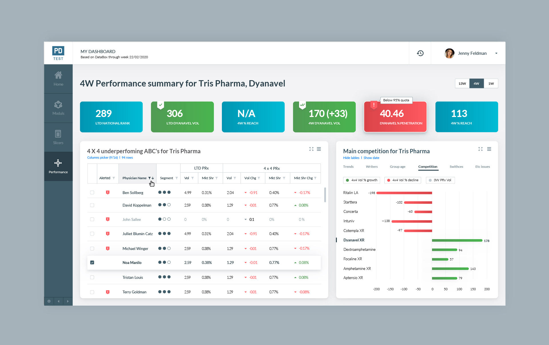
Table Pop-Ups: as part of the filtering process across the table, I also designed
1. Pop-up for the required table columns picker
2. Pop-up for plotter by category in the table
1. Pop-up for the required table columns picker
2. Pop-up for plotter by category in the table

Icons & Colors Language
